Client: Ferndale Food Bank
Ferndale Food Bank is driven by the belief that everyone deserves access to quality food that is good for you.
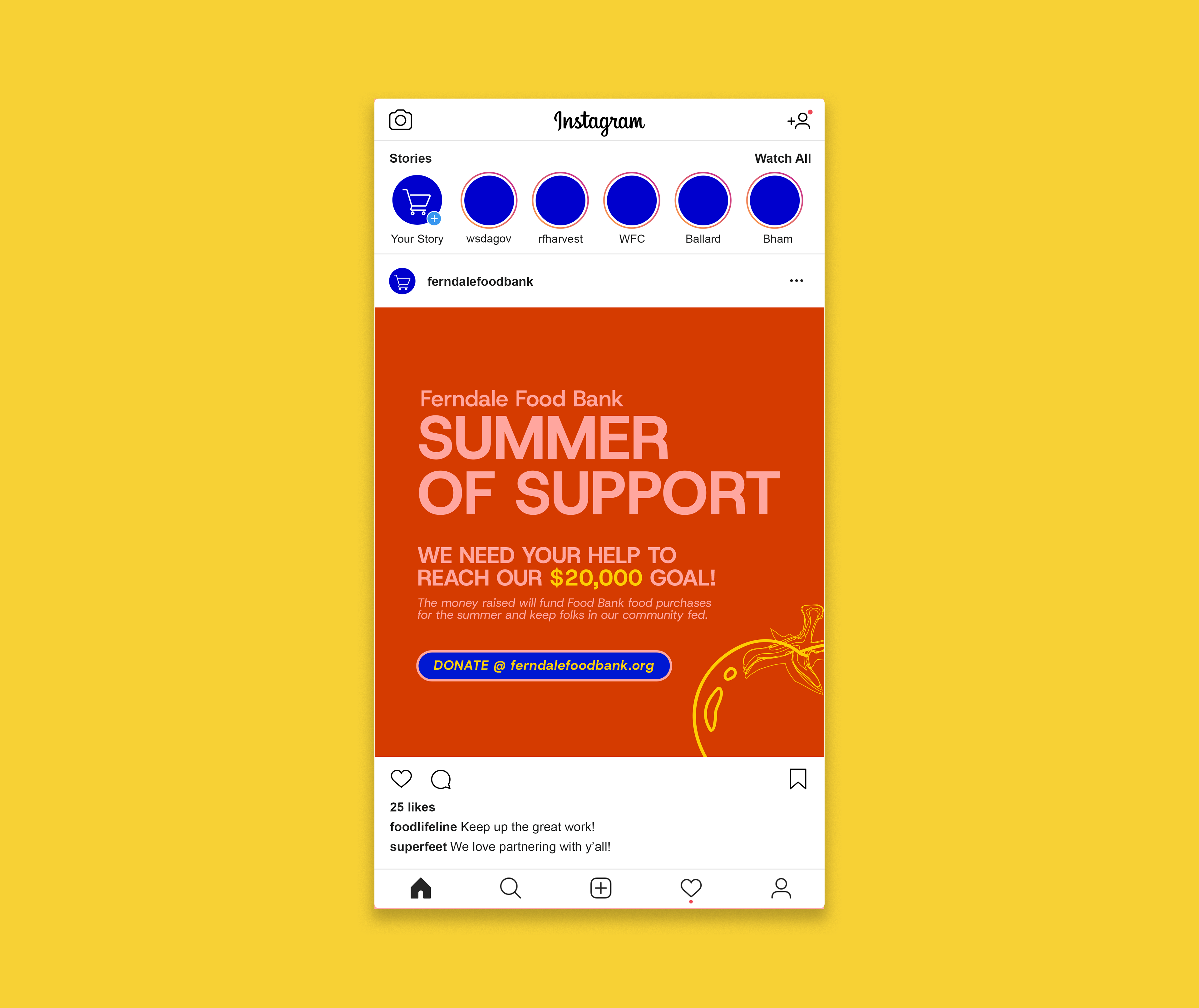
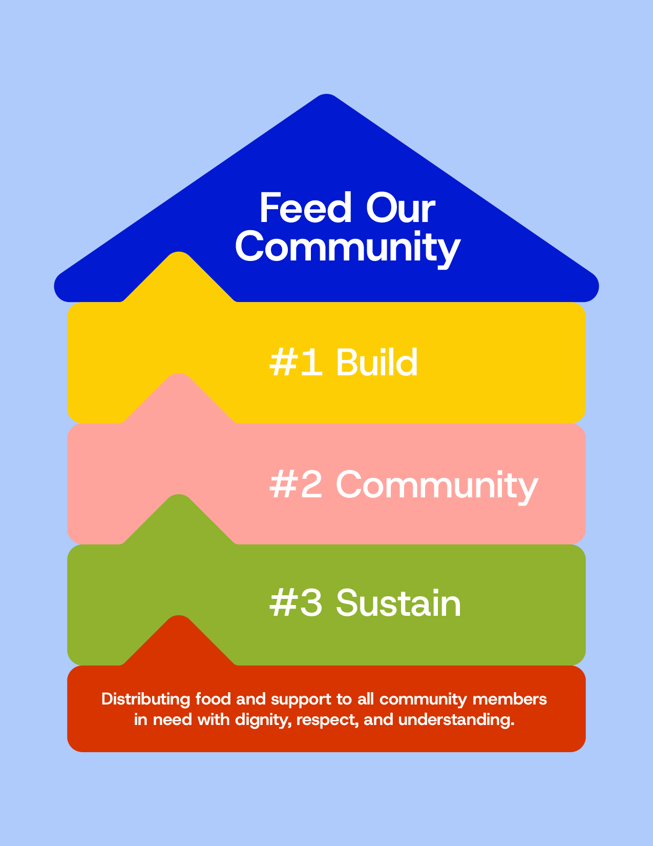
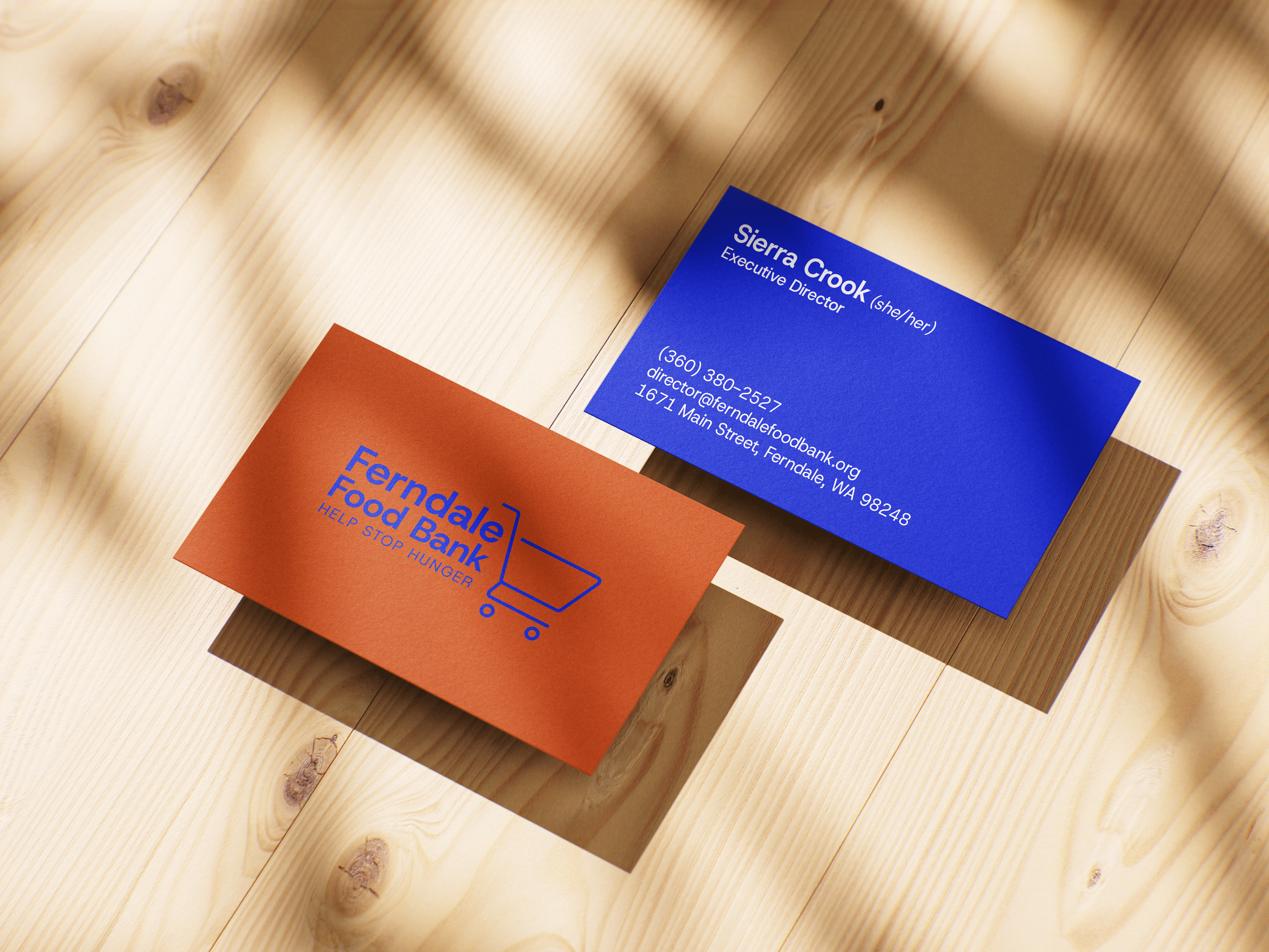
The ultimate goal for the Ferndale Food Bank, and many others around the country, is to have a client shopping model that operates as a standard grocery store. This model helps to restore the dignity of clients, by providing them with an autonomous shopping experience. In alignment with this effort, I worked with the Ferndale Food Bank to give their brand a refresh that would move it into the future, while maintaining assets like the shopping cart, to uphold recognizability.
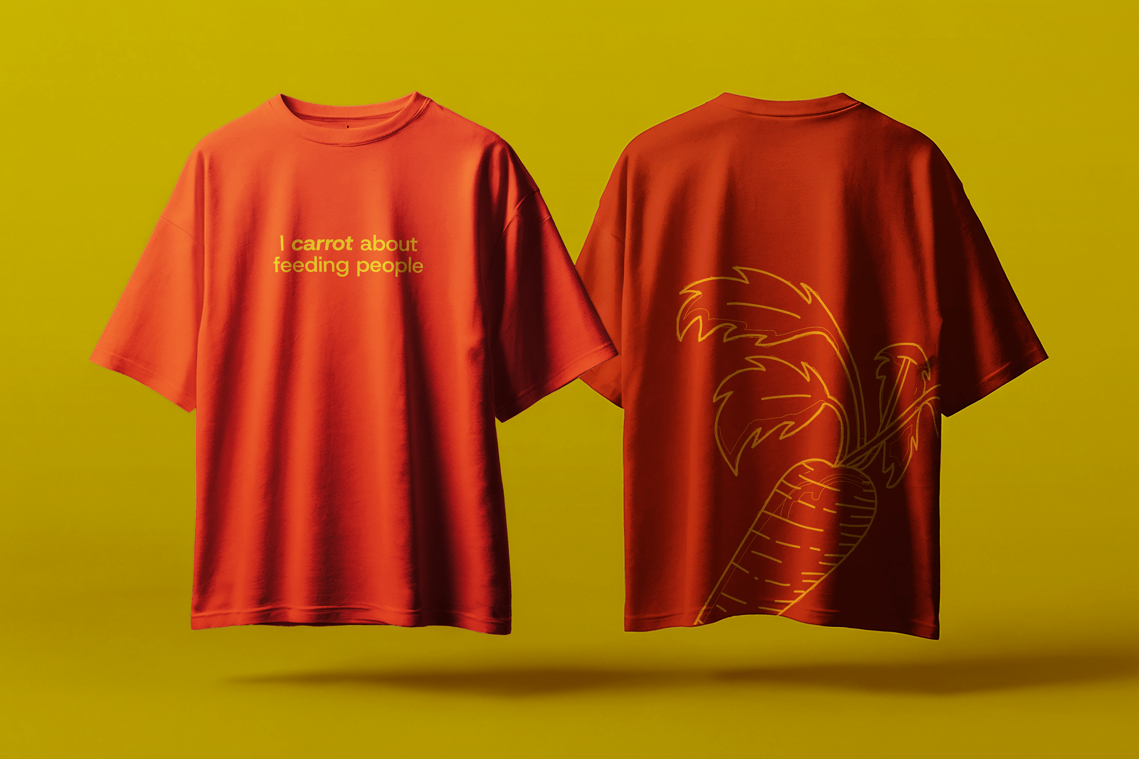
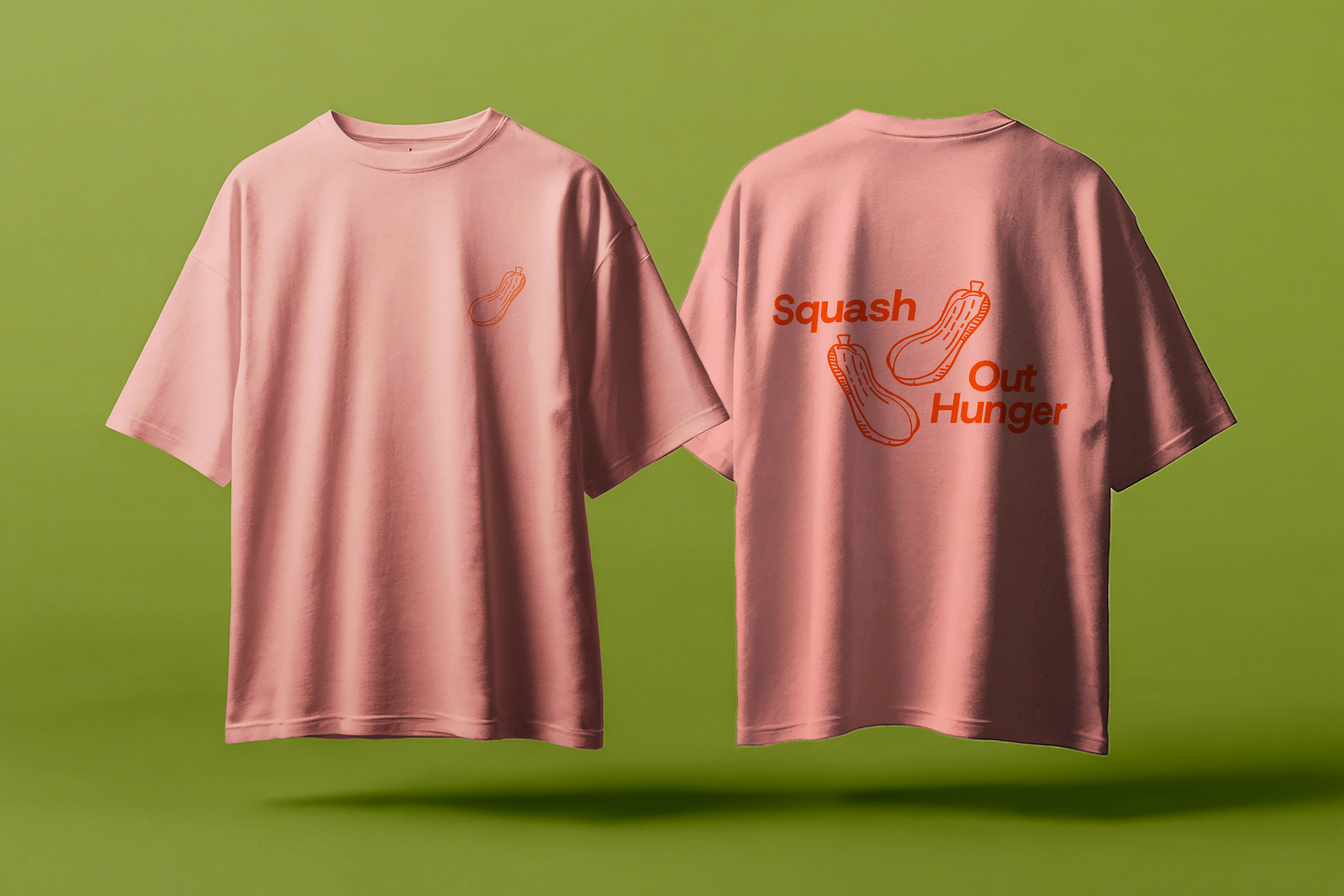
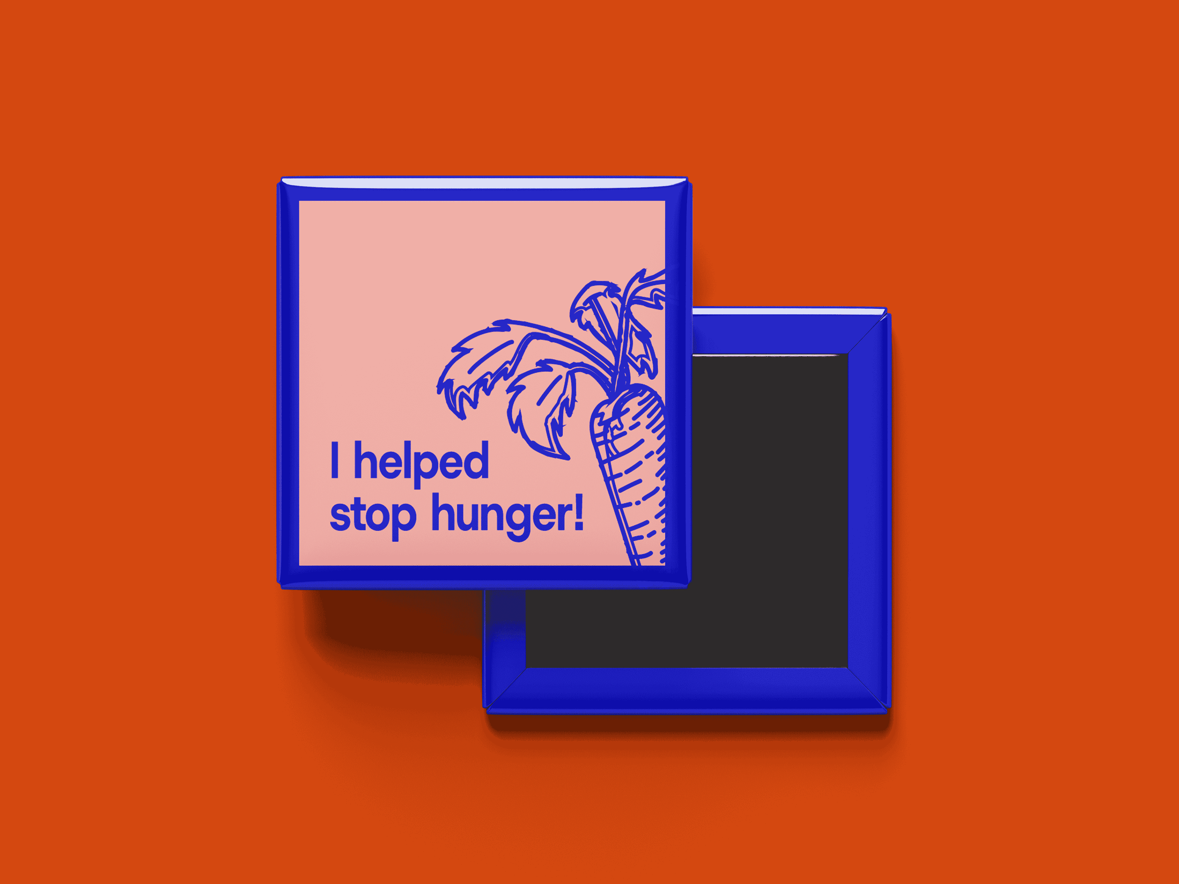
What came of this simple, yet personable brand refresh, is a visual identity defined by a rich color palette reflective of produce and other food sources, approachable typography, a familiar suite of logos, and deliverables that resemble what one can expect from their favorite brand.
Logo & Brand Identity Refresh | Collateral